WARNING: The 2.x versions of Elasticsearch have passed their EOL dates. If you are running a 2.x version, we strongly advise you to upgrade.
This documentation is no longer maintained and may be removed. For the latest information, see the current Elasticsearch documentation.
Extended Exampleedit
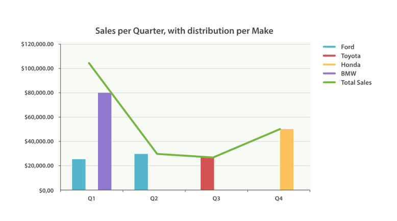
Just as we’ve seen a dozen times already, buckets can be nested in buckets for more-sophisticated behavior. For illustration, we’ll build an aggregation that shows the total sum of prices for all makes, listed by quarter. Let’s also calculate the sum of prices per individual make per quarter, so we can see which car type is bringing in the most money to our business:
GET /cars/transactions/_search
{
   "size" : 0,
   "aggs": {
      "sales": {
         "date_histogram": {
            "field": "sold",
            "interval": "quarter",
            "format": "yyyy-MM-dd",
            "min_doc_count" : 0,
            "extended_bounds" : {
                "min" : "2014-01-01",
                "max" : "2014-12-31"
            }
         },
         "aggs": {
            "per_make_sum": {
               "terms": {
                  "field": "make"
               },
               "aggs": {
                  "sum_price": {
                     "sum": { "field": "price" }
                  }
               }
            },
            "total_sum": {
               "sum": { "field": "price" }
            }
         }
      }
   }
}
|
Note that we changed the interval from |
|
|
Calculate the sum per make. |
|
|
And the total sum of all makes combined together. |
This returns a (heavily truncated) response:
{
....
"aggregations": {
   "sales": {
      "buckets": [
         {
            "key_as_string": "2014-01-01",
            "key": 1388534400000,
            "doc_count": 2,
            "total_sum": {
               "value": 105000
            },
            "per_make_sum": {
               "buckets": [
                  {
                     "key": "bmw",
                     "doc_count": 1,
                     "sum_price": {
                        "value": 80000
                     }
                  },
                  {
                     "key": "ford",
                     "doc_count": 1,
                     "sum_price": {
                        "value": 25000
                     }
                  }
               ]
            }
         },
...
}
We can take this response and put it into a graph, showing a line chart for total sale price, and a bar chart for each individual make (per quarter), as shown in Figure 38, “Sales per quarter, with distribution per make”.
